Virto Kanban Board App for Microsoft Teams | Try for free
Elevate your team's productivity with the Virto Kanban Board for Microsoft Teams. Simplify task management & track projects effortlessly. Get your free trial!
Price: 2
Price Currency: USD
Operating System: Windows, OSX
Application Category: BusinessApplication
4.9
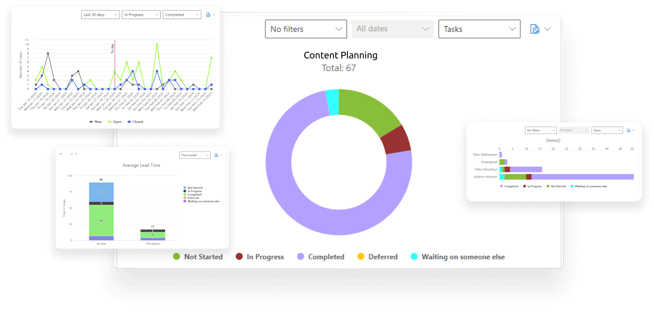
SharePoint Integration
Transform raw data into dynamic visual reports within Teams through integration with SharePoint lists.
Customizable Dashboards
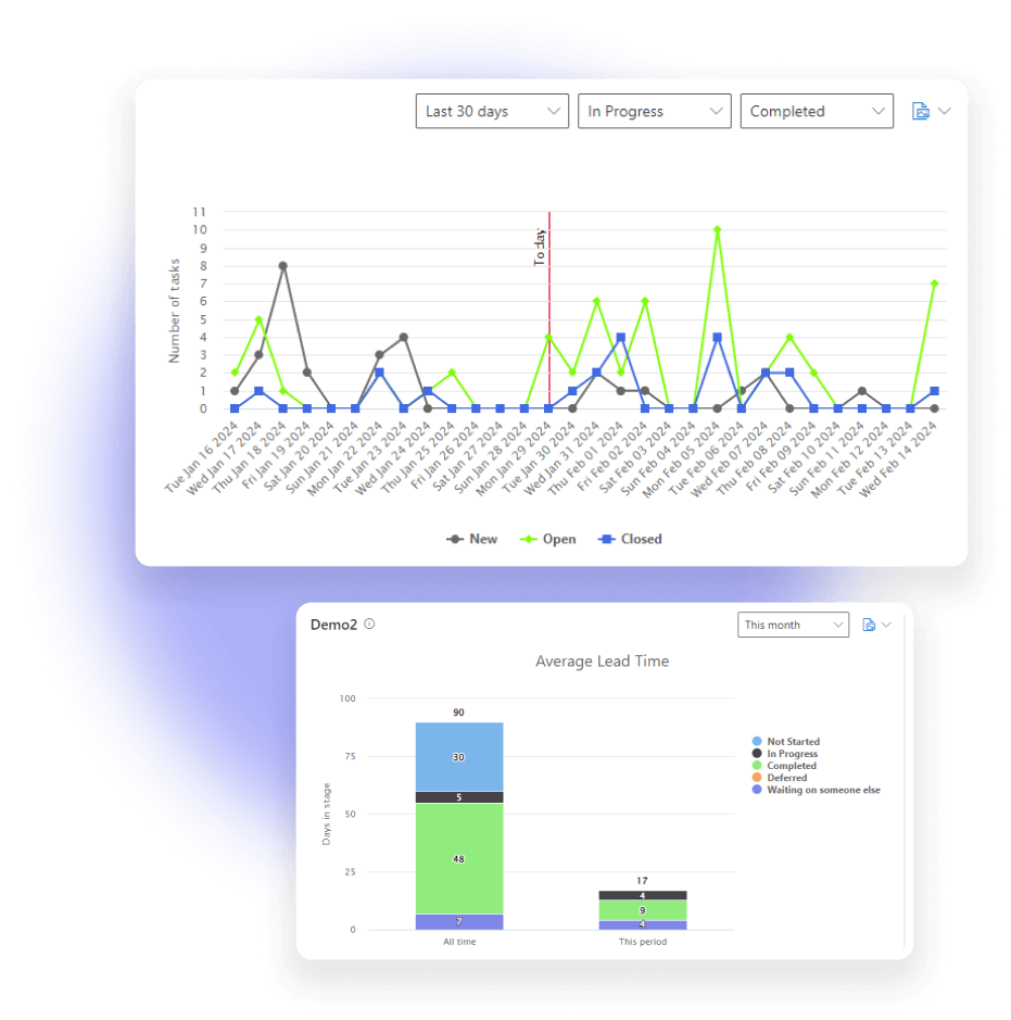
Customize dashboards with status, team member, completion charts, lead times, and burndown charts.
Efficiency Measurement
Analyze team efficiency, workload distribution, and task completion dynamics with tailored charts.

Real-Time Data Visualization
Provide up-to-the-minute insights for timely decision-making with data visualization capabilities.
Diverse Chart Options
Offer a variety of chart and dashboard formats within Teams to suit different objectives.
Work Progress and Bottleneck Identification
Use Completion and Burndown Charts to track project progress, pinpoint delays, and visualize outstanding tasks.
Microsoft Teams
Optimize your Teams workspace with Virto Charts, integrating detailed project timelines into team channels.
Microsoft SharePoint
Centralize project management in SharePoint with Virto Charts, merging timelines with document control.

Purchase Info & Discounts
After you press the “add to cart” button, you will be forwarded to a secure zone of our processing partner Avangate, where you can select quantity, select additional services, and finish checkout.
Educational & Non-Profit Discounts
We are glad to offer a set of special 20% discounts for schools, colleges, universities, hospitals and charity organizations. Please contact our sales department for more information.
Contact Sales for Corporate Quotes
Looking for a tailored solution for your business? Our Sales team is ready to work with you to understand your company's unique needs and provide a custom quote.

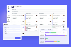
Virto Kanban Board
Boost team productivity with Virto Kanban for Teams: a seamless, efficient task & project management tool.

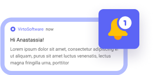
Alerts & Reminders
Elevate Microsoft Teams with an app for direct notifications and reminders, ensuring team alignment.